Redesigning Direct Energy Business: A Scalable, Impact-Driven Approach
In May 2015, Direct Energy’s residential division launched a complete redesign of its customer-facing website. To ensure branding consistency while maintaining a distinct identity for the business division (DEB), the UX team initiated the DEB redesign project in June 2015, where I served as the UX lead.
The project presented unique challenges. Before starting the design, we needed to align DEB with the residential division (DER) while distinguishing it as a provider for businesses. To achieve this, I identified three to four primary colors from the DER palette and four commonly used page layouts from their higher-traffic pages. These insights guided updates to the style guide and informed the creation of mockups for DEB’s most-visited pages.
The sheer scope of the project was daunting: over 1,000 pages, including blogs, campaign landing pages, and product pages, needed updates. The main challenge was not just design but developing an efficient strategy to maximize output while minimizing demands on UI developers. My solution was to identify website elements that could be updated site-wide without disrupting functionality, streamlining the process significantly.
Content and imagery were also critical to the redesign’s success. With over 100 new assets required, I defined asset requirements and collaborated with a newly onboarded graphic designer and content strategist to address these needs efficiently.
On August 10, 2015, the redesigned DEB website went live, delivering a modern look and feel, improved navigation, and clearer calls to action. Post-launch analytics confirmed significant improvements across key performance indicators, including increased traffic, longer time on site, higher click-through rates, and enhanced lead generation.
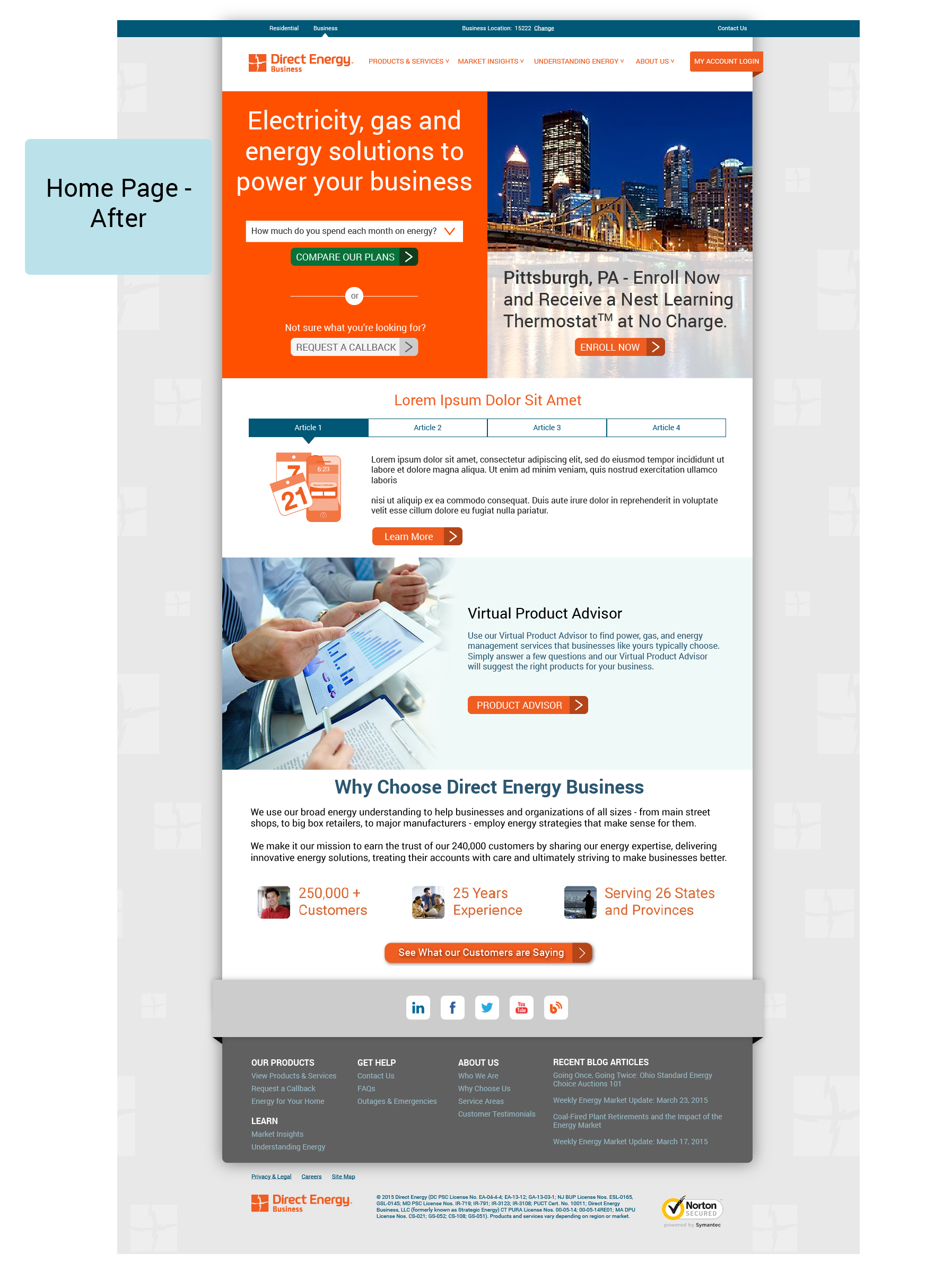
DEB Website Redesign: Transforming the Homepage
The redesign of Direct Energy Business’s homepage transformed an overly simplistic, uninspiring layout into a dynamic, user-focused experience. The original page lacked engaging elements and gave users little reason to explore further.
The updated design introduces:
Dynamic Visual Hierarchy: Bold headlines, vibrant CTAs like “Compare Our Plans,” and visually engaging sections draw attention and encourage interaction.
Enhanced Vertical Scrolling: The redesign leverages vertical scrolling to present more content seamlessly, reducing the effort needed to navigate compared to clicking through links.
User-Centric Content: Features like energy-saving calculators and credibility-building sections (e.g., “Why Choose Direct Energy Business”) provide clear value to users.
Stronger Branding: Modern visuals, a cohesive color palette, and high-quality imagery reinforce professionalism and trust.
This redesign uses scrolling to deliver more information intuitively while creating a compelling and interactive experience that aligns with user behavior and expectations.

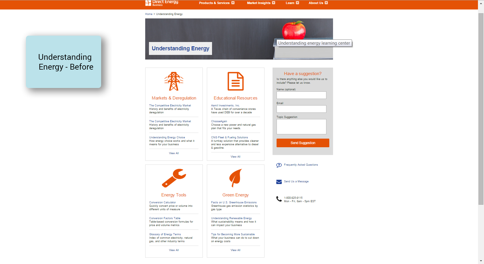
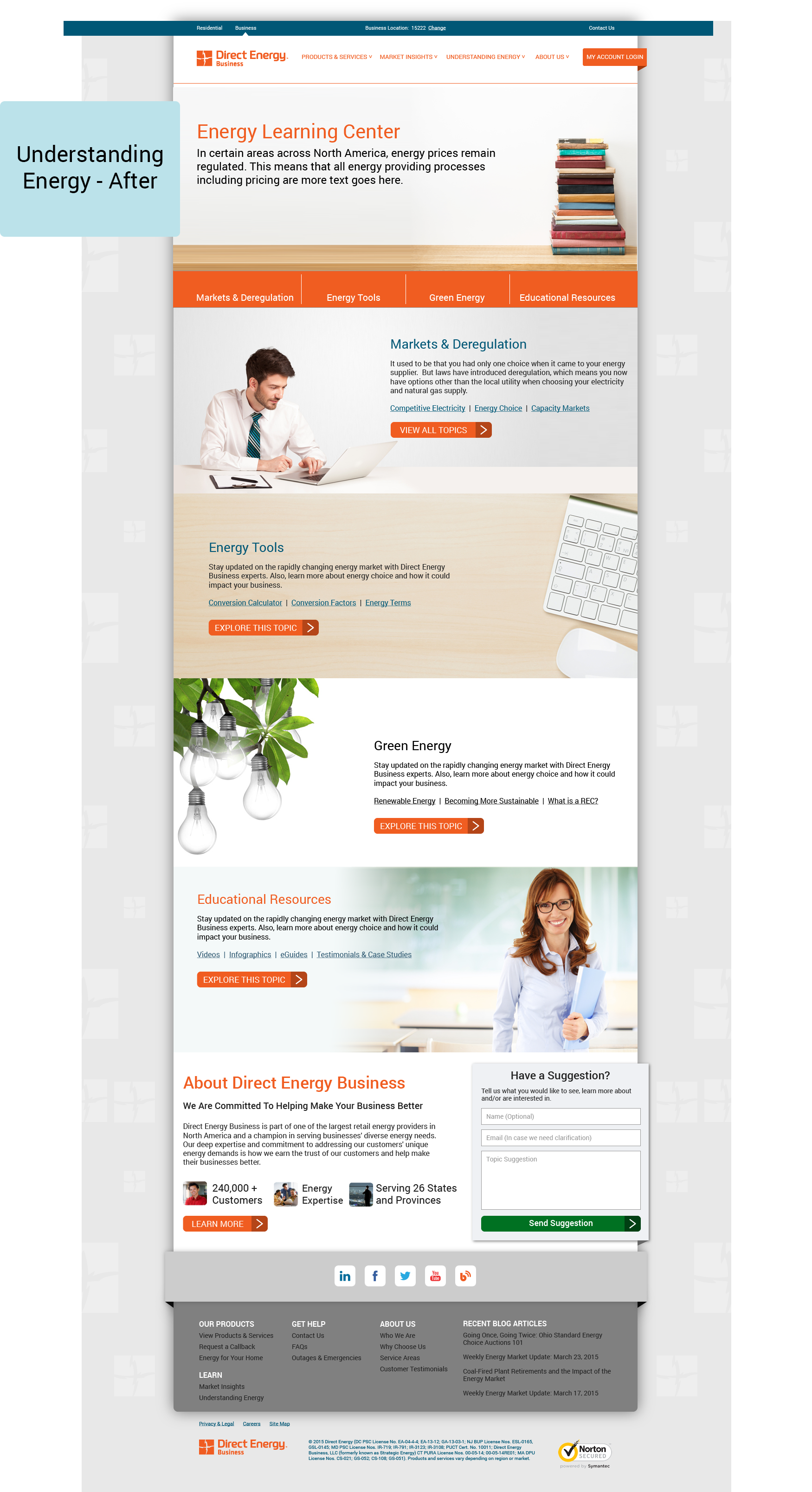
Understanding Energy Page Redesign: From Static to Engaging Learning Hub
The redesign of the "Understanding Energy" page transformed a static, uninviting layout into a dynamic and user-focused learning center.
Before:
The original design relied on a basic grid layout with minimal visual cues and text-heavy sections. While functional, it lacked the depth and interactivity needed to engage users effectively. The absence of a strong visual hierarchy made it difficult to prioritize or explore the content intuitively.
After:
The redesigned page introduces a modern, content-rich layout with several key improvements:
Enhanced Visual Appeal: High-quality imagery and design elements break up text and create a more engaging experience.
Clear Hierarchy and Navigation: Sections like “Markets & Deregulation” and “Energy Tools” are well-defined with strong visuals and actionable links, guiding users effectively.
Vertical Scrolling for Exploration: The redesign leverages vertical scrolling, allowing users to explore content seamlessly without the need for excessive navigation clicks.
Contextual Content: The "Energy Learning Center" introduction provides a clear purpose for the page, aligning it with user needs for accessible, valuable information.