Redesigning Supply Chain Management: A Map-Centric Solution for IMOS
The Supply Chain Visualization (SCV) project aimed to transform Aspen’s inventory management and operations scheduling application (IMOS) by introducing a modern, map-centric UI. While IMOS was a powerful tool for petroleum supply chain specialists, its reliance on spreadsheets often left users overwhelmed and struggling to utilize their data effectively. Common feedback described the experience as "getting lost in the spreadsheets." SCV addressed this challenge by providing an intuitive, end-to-end visualization of petroleum products—ranging from unprocessed crude oil to unleaded gasoline—within the supply chain. This allowed users to quickly identify optimization opportunities without sifting through endless spreadsheet data.
As the UX designer on the project, I began by identifying user pain points with the existing IMOS interface. This research informed how information should be structured and displayed on the supply chain map, the centerpiece of the new dashboard. Collaboration with the product management team was essential to align on the minimum viable product (MVP) for the initial release.
We conducted validation testing with a major petroleum manufacturer, which provided valuable insights. While the feedback was positive, it also highlighted areas for improvement. For the final phase of the project, I created high-fidelity mockups, incorporating modern design principles inspired by Google’s Material Design to ensure the UI met user expectations for functionality and aesthetics.
From Spreadsheets to Sleek: The Evolution of Supply Chain Visualization
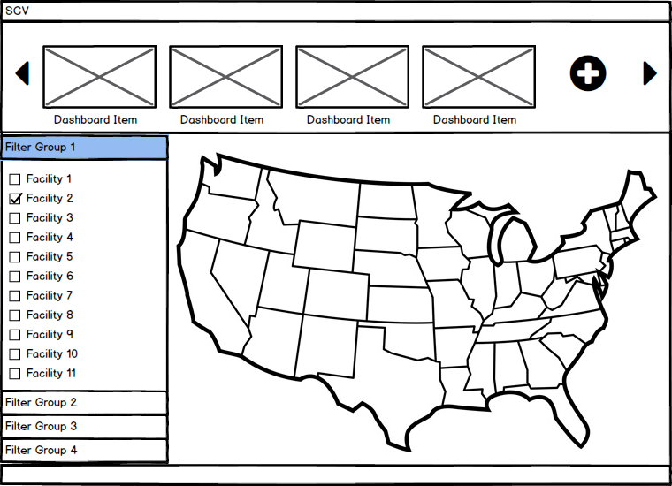
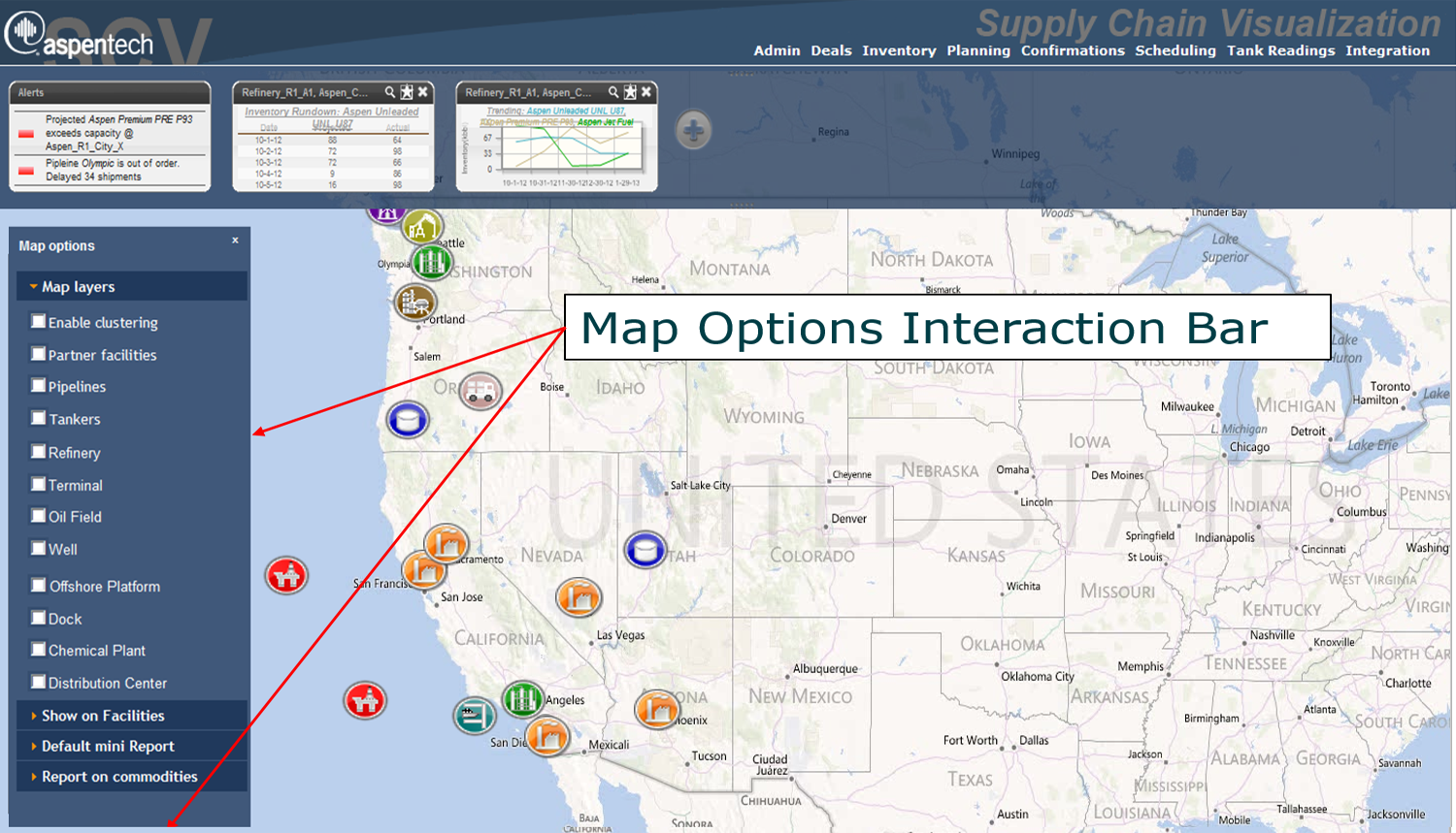
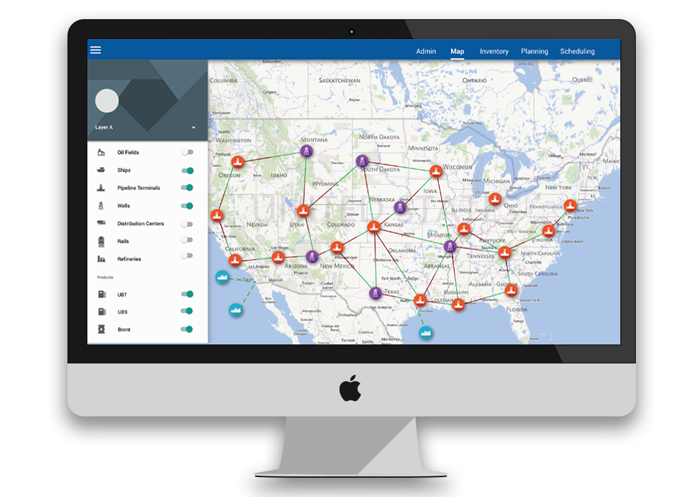
The following gallery showcases the transformation of the Supply Chain Visualization (SCV) project, starting with the original spreadsheet-based interface of the IMOS application. Each subsequent image highlights a step in the design process, from low-fidelity wireframes that focused on structure and layout to high-fidelity mockups that brought the vision to life with refined visuals and interactivity. The final design exemplifies a modern, map-centric interface, turning a complex spreadsheet tool into an intuitive and visually compelling experience for users.